
Redesign IOS Control Center
In January we got a task to redesign a part of our daily mobile experience. We started mapping out which apps that we use on a regular daily basis and started to research every app very thorough. In some of the apps there were a few problems but it wasn‘t really enough to just change something small. So we went back and mapped out the apple apps in our phones. What was wrong there?
But eventually we came to the exclusion that it all went back to IOS. We didn‘t really like how you could switch through apps and it just felt messy. Since we all were multitaskers, we needed a good way to work with our phones. How do we easily and effortless switch between apps?
My role during the project was to do research about other design options and features that we wanted. Also how it should look. The project was 4 weeks long and we worked in groups of three.
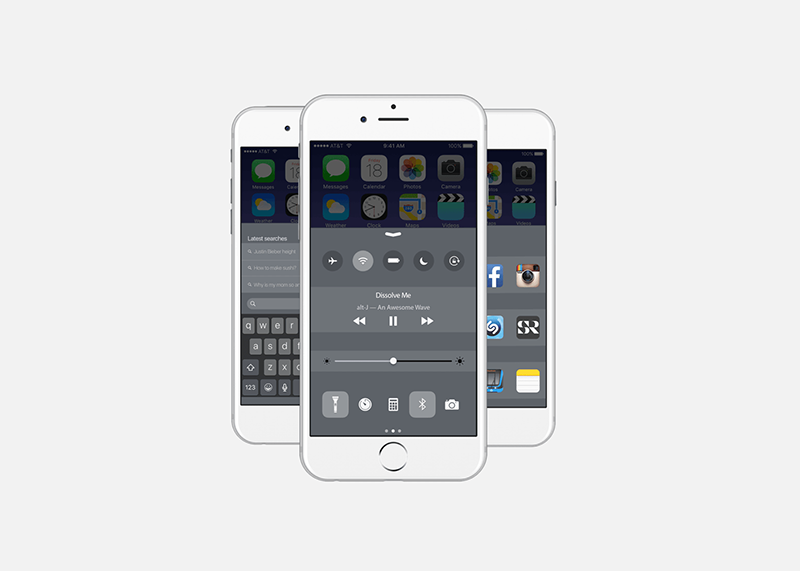
So this is our vision for the new iOS Control Centre optimized for multitasking. See video down below and check out the article that we wrote for Medium here.


